Interview: Meet Peter Biľak - founder of Typotheque
Gå til innholdet
Peter Biľak was born in Czechoslovakia and lives now in the Netherlands. He started a design studio in The Hague, Netherlands, where he works in the field of editorial, graphic and type design, combined with part time teaching at the Royal Academy of Arts in the Hague. In 1999 he started Typotheque type foundry, and in 2000 he founded, edited and designed the art & design journal DOT DOT DOT. In 2009 Peter co-founded the Indian Type Foundry, he is now writing for various design related magazines and collaborating on creation of modern dance performances.
_ Hi Peter, how are you doing?
Very well thank you for asking.
_ What are you working on right now?
I am just finalising the largest type project I've yet worked on, it is Greta Sans, which is exploring the relationships between text and display fonts, looking at the entire design space available to type families. It's been a project I've worked on the past 4 years. Greta explores a multidimensional continuum of possibilities, going beyond the relationship between weight and width, it comes with 80 styles. Even the intervals between the styles are an integral part of this unified typeface system.
I am also working on the bilingual book of my design essays that will be published by a smaller Prague-based publisher.
And finally, a few years back I started a company in India (indiantypefoundry.com), where we have plenty of work to bring out quality typefaces for the many Indian writing scripts which are in use.
_ Would you share a picture of your work area with us?
_ Why did you choose to focus your interest on type design? What do you like about typography?
I am interested in all aspects of text and language. Writing articles is one expression of this interest - designing type is another one - looking at the formal attributes of text. And finally, interest in languages fuels my work with non-Latin type - Cyrillic, Greek, Arabic, Armenian, Hebrew, Indic languages. I am looking for different expressions of language, and typeface design is my medium.
_ Do you think of all platforms when you create a font, or do you think of print first and then work all your way through?
It depends on the design concept - sometimes, the low resolution media are most important, sometimes they are just complimentary to print. One thing is clear - more reading happens on screen, so it makes sense to consider how the font will work on the computer monitor, mobile phones, tablets. We do test fonts on a variety of output devices.
_ You were one of the first persons offering a webfont service. What does it mean and why did you decide to do this?
As a type foundry, I am interested in seeing my fonts used. Before, when someone asked to used our fonts on the web, we advised them to convert text to images. This is far from ideal - the text becomes unreadable, you can't search it, cannot be indexed. So we thought of a better solution. I believe it is responsibility of type foundries to innovate, and reacting to the latest development. Besides developing fonts, I work with 2-3 programmers, on developing tools to make our work easier, to make our website more useful, and to help our users. So making a webfont system was a logical outcome,
_ Are all of your fonts suitable for web? When does a font qualify for web usage?
We have a large collection of fonts by now. We divide them in various categories, and offer special fonts for reading on screen in small sizes, fonts that can work on print and screen, and we also design for display use. The display fonts work also in the web, but need to be used in larger sizes.
_ With all the new media platforms emerging, like pads, smart phones, smart TV, and all the different operating systems (IOS, Windows, Android) and so on, in which way does that challenge font development?
Traditionally the fonts were designed only for the highest resolution, and many of its details cannot be rendered properly in the low resolution output. Knowing that the fonts can be printed in offset printing at 2400 dpi, but also on low resolution screens at 72dpi poses a significant challenge, and designer needs to make choices when designing type. It is hard to be elegant at the high resolution and still use shapes which are robust enough to survive rendering in 9 points on a monitor. This is where hinting comes to help.
_ In short, what is font hinting and why is it important?
Hinting modifies the originally design outlines depending on the selected size. If you remember the matrices of the metal type, the 9pt cut was different than the one for 24 points. Hinting does the same, it optically adjusts the shape, and controls the way outlines render on the computer screen. Hinting is programming instructions that fine-tune a font’s rasterisation, the process by which its mathematically ideal outlines are mapped onto a monitor’s pixels.
Peter Biľak: Font hinting
_ Is there any tip that you would like to give us about using typography on screens?
Test, test and test. Before, when we had a bunch of 'web-safe fonts' meant that they were all tested by their developers, and guaranteed that they worked well across different platforms. Now we have many more fonts available, some will not work well in all conditions, so it is designer's call to test it in different platforms, in different browsers. The fonts will look different, as they are different rasterizers which affect how fonts look like. Not all fonts work equally well in different media - still 99% of all fonts were designed for printing mainly.
_ Sometimes you approach typography very experimentally, for example by adding/challenging functionalities. Where do you get the inspiration from?
The typefaces which I admire (Jenson, Romulus, Akzidenz Grotesk, Univers, Syntax, etc) always brought something new to the discipline of type design. Type design is not only a craft of making functional typefaces, but there is also an expectation that the design makes something that could not have made before, using the contemporary conditions. So with my work, I also try not just to recreate the past, but look for new ideas. History, for example, could not have existed before, it uses latest technology to allow designer to mix and combine layers inspired by the evolution of western typography. So it is introspective approach for which one needs time and perspective.
History typeface system, 1996-2008
Based on a skeleton of Roman inscriptional capitals, History includes 21 layers inspired by the evolution of typography. These 21 independent typefaces share widths and other metric information so that they can be recombined. Thus History has the potential to generate thousands of different unique styles. History is available as a collection of 21 OpenType fonts that can be used just as any other fonts, and also as part of the layering software History Remixer.
_ You are not only designer, typographer and writer, you also teach and work with modern dance. In which way do all your interests influence each other? Are there any obvious synergies?
I think the different aspects of my work help each other. When I am writing I look at the text very differently than when I am designing type - so it helps to switch between the micro and macro, to have a large perspective, yet pay attention to details. It prevents from monotony, routineness. At the same time, there will inevitably be connections between different parts of work. In DanceWriter, typography, video, dance come together.
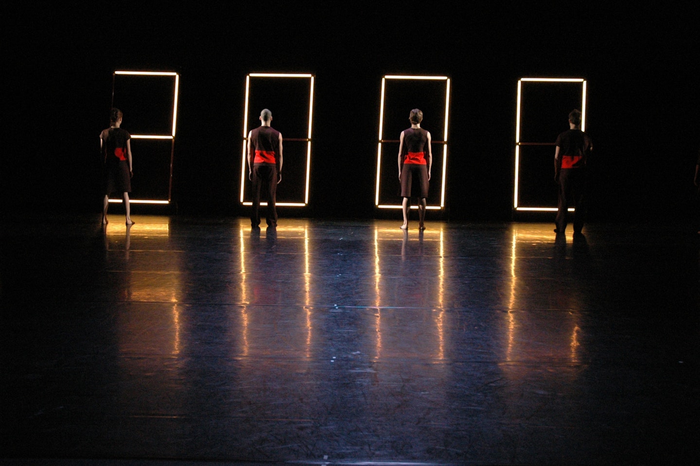
Twenty (dance performance)
Concept of a dance performance. Large clock was built using Philips Philinea light lamps, controlled by a custom software. The clock functioned as a timer, counting down the seconds of the performance, only the time was getting faster or slower according to the movement of the dancers on the stage.
'Twenty' focuses on the basic element of dance: time. "How long is a minute, or a single second?" This dance piece challenges the expectation of the viewer, and explores the dimensions of time and the human interpretation. Twenty is another of collaboration Lukas Timulak and Peter Bilak.
Due a due (dance performance)
Concept of a dance performance. What appears as a shadow of the dancer is in fact a back-projection of the silhouette of the dancer, projected live with a few second delay. This situation allows a single dancer to dance a duo with himself.
'Due a due', was conceived originally for the NDT's* choreography workshop in 2005, and later reworked into a full dance piece presented in various locations.
Programming of this custom filter was done by Resolume, whose software we also used for the live performance.
* Nederlands Dans Theater
_ What are your plans for the future?
I have very long term plans - one is that I don't wish our studio to grow in terms of personnel - I want to keep working with 2-3 people, so I don't become a manager, but have my hands on projects directly. And continue doing work that satisfies me personally - innovative Latin typefaces, but also work in India, developing fonts for languages that never had digital fonts, helping to preserve those languages, and improving the level of typography for the major languages.
Intervju: Astrid Feldner, Bleed.